8
Directed by Michael Thomas
Humboldt State University
Fall 2012
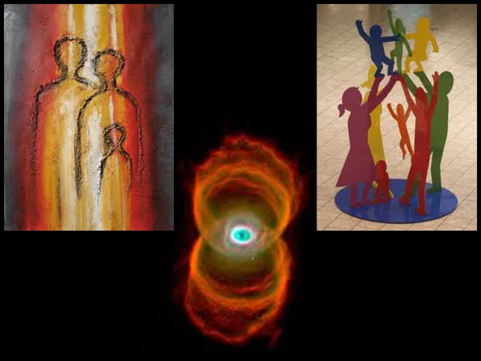
As it was my first realized scenographic design, I worked hard to come up with a comprehensive metaphor, or feel, for 8. I felt that the tone, palette, and emotional response of these combined images best fit our production.
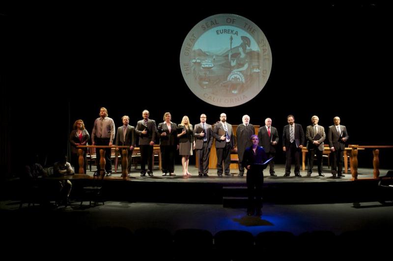
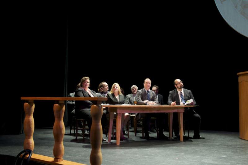
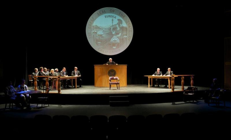
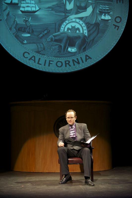
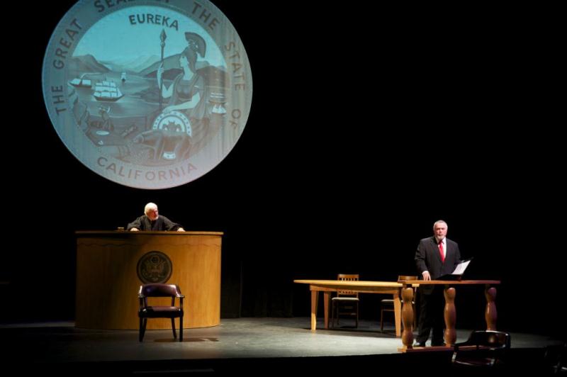
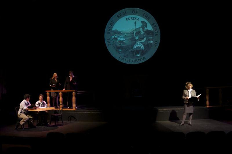
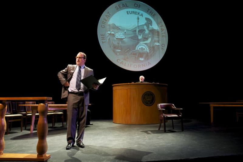
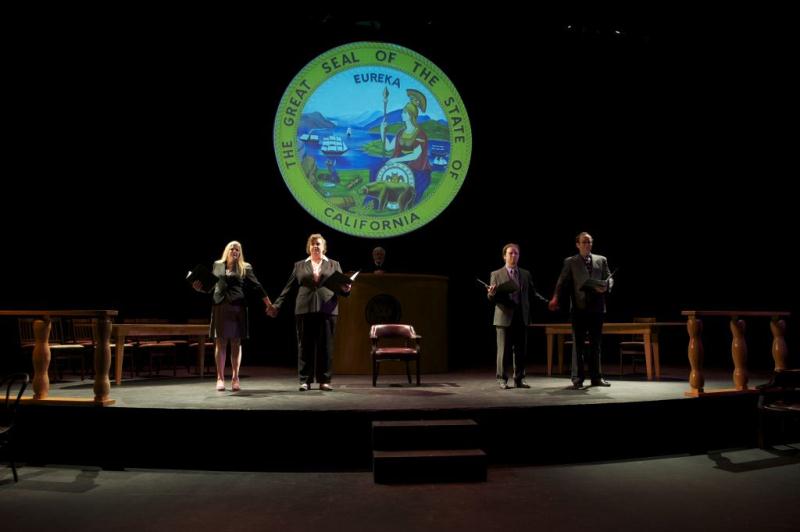
Our production was part of the staged reading series across the United States. Our show, like the others across the country, was for one night only, so we used our largest theatre space. For me, this meant that I had to make this play visible yet intimate in a large space. To try to help with this, I brought the mid-stage traveler across and only used the apron and the front half of the stage. I also lowered the lift in our apron half-way, so it bridged the gap between the audience and the actors. This also served to separate my set into two worlds: the higher world of the court room, peaked by the judge’s fortress desk, and the lower, closer, world of the family.
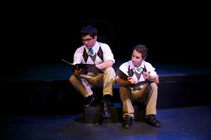
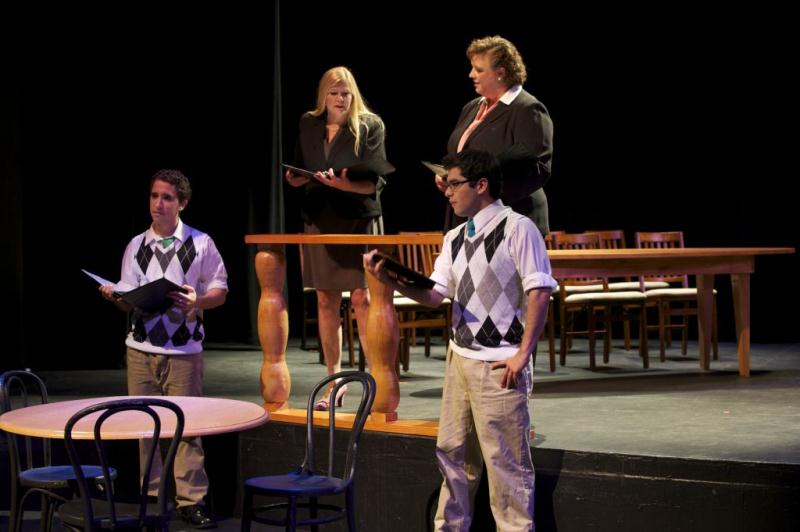
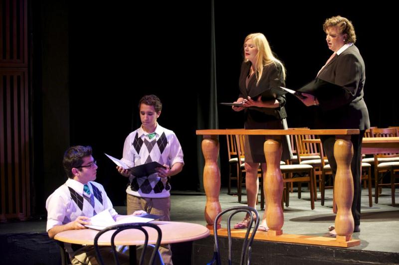
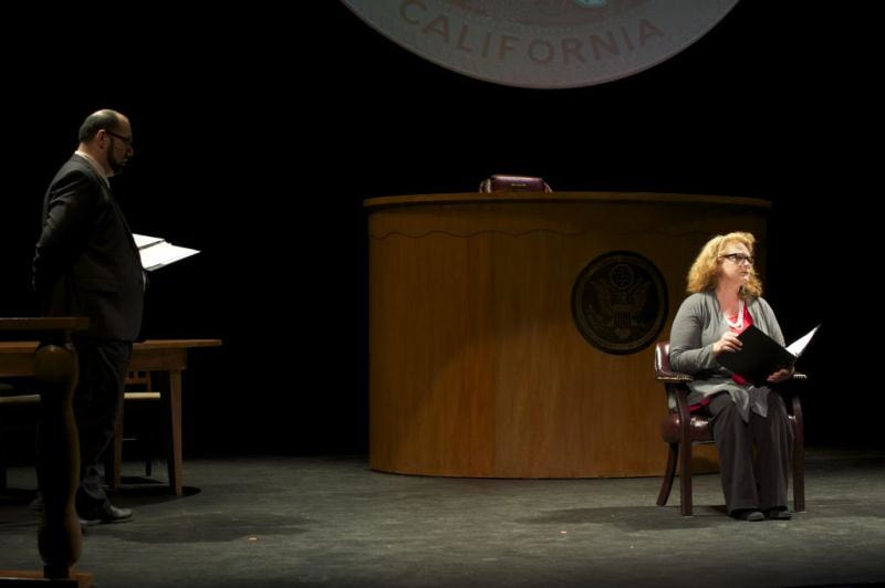
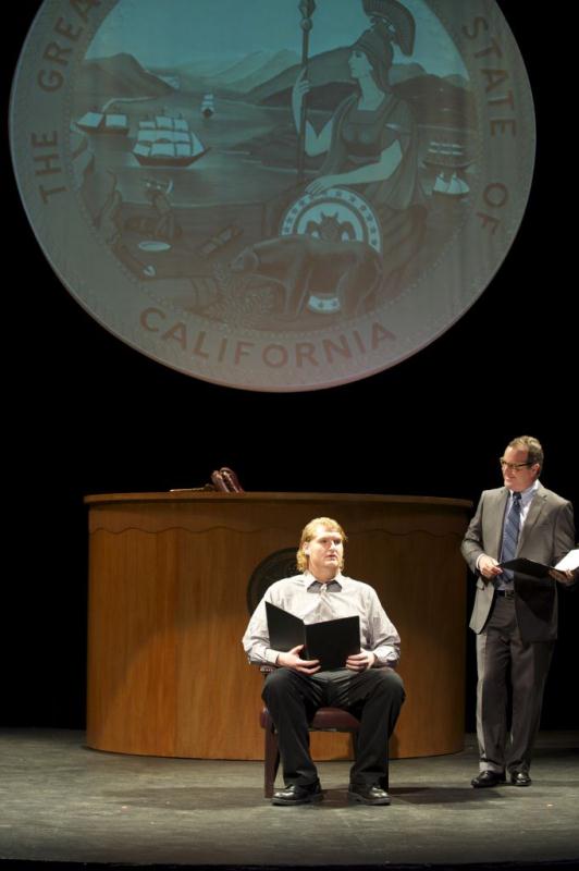
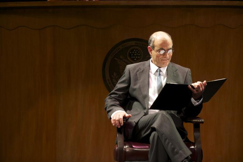
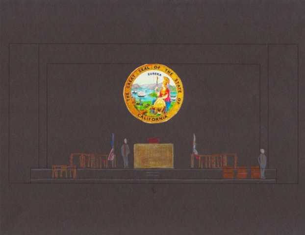
As the scenic designer, I was tasked with creating budget and labor breakdowns, as well as detailing the six large set pieces that we constructed. These consisted of the large, round projection screen, the Judge’s fortress, the two lawyer’s tables, and the two balustrades that separated the court from the family’s world. The curvilinear nature of the set was evident not only in the crescent shape of the Judge’s desk, but even in its scalloped trim, which also echoed the balustrades.
When it came to lighting, I really wanted to tie in all the colors from our metaphor. The warm ambers and oranges of the set could be accented by lavenders, reds, and blues in the lighting, just as they accented the first two images in my composite metaphor. With tight focusing, the lights could fill the
stage, or become quite intimate.
Projected onto the round screen were the videos of evidence in the trial and the state seal. In the final, hopeful, moments, the colors of the seal were fully restored.
Humboldt State University
Fall 2012
As it was my first realized scenographic design, I worked hard to come up with a comprehensive metaphor, or feel, for 8. I felt that the tone, palette, and emotional response of these combined images best fit our production.
Our production was part of the staged reading series across the United States. Our show, like the others across the country, was for one night only, so we used our largest theatre space. For me, this meant that I had to make this play visible yet intimate in a large space. To try to help with this, I brought the mid-stage traveler across and only used the apron and the front half of the stage. I also lowered the lift in our apron half-way, so it bridged the gap between the audience and the actors. This also served to separate my set into two worlds: the higher world of the court room, peaked by the judge’s fortress desk, and the lower, closer, world of the family.
As the scenic designer, I was tasked with creating budget and labor breakdowns, as well as detailing the six large set pieces that we constructed. These consisted of the large, round projection screen, the Judge’s fortress, the two lawyer’s tables, and the two balustrades that separated the court from the family’s world. The curvilinear nature of the set was evident not only in the crescent shape of the Judge’s desk, but even in its scalloped trim, which also echoed the balustrades.
When it came to lighting, I really wanted to tie in all the colors from our metaphor. The warm ambers and oranges of the set could be accented by lavenders, reds, and blues in the lighting, just as they accented the first two images in my composite metaphor. With tight focusing, the lights could fill the
stage, or become quite intimate.
Projected onto the round screen were the videos of evidence in the trial and the state seal. In the final, hopeful, moments, the colors of the seal were fully restored.
Metaphor
Scenic Design
|
Color Rendering
|
Plot, Model Box, Elevation, and Working Drawings
|
|
Scenic References
|
Progress Shots
|
Lighting Design
|
Light Plot
|
Light Region Plot, Sections, Keys, Magic Sheets, and Gels
|
Final Look